brand and packaging re-design, new brand identity,
new category product's design, portfolio visual management, products naming
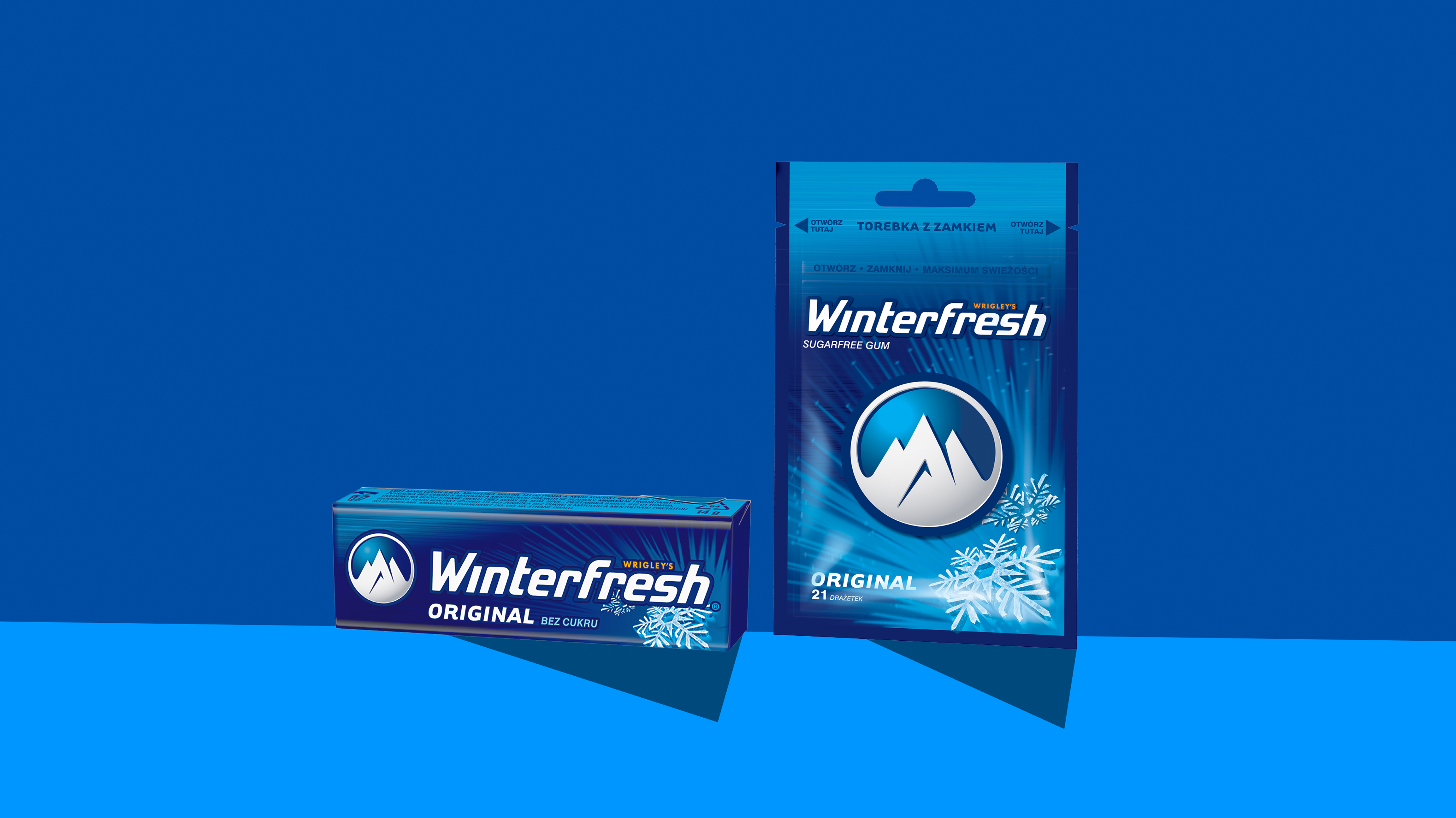
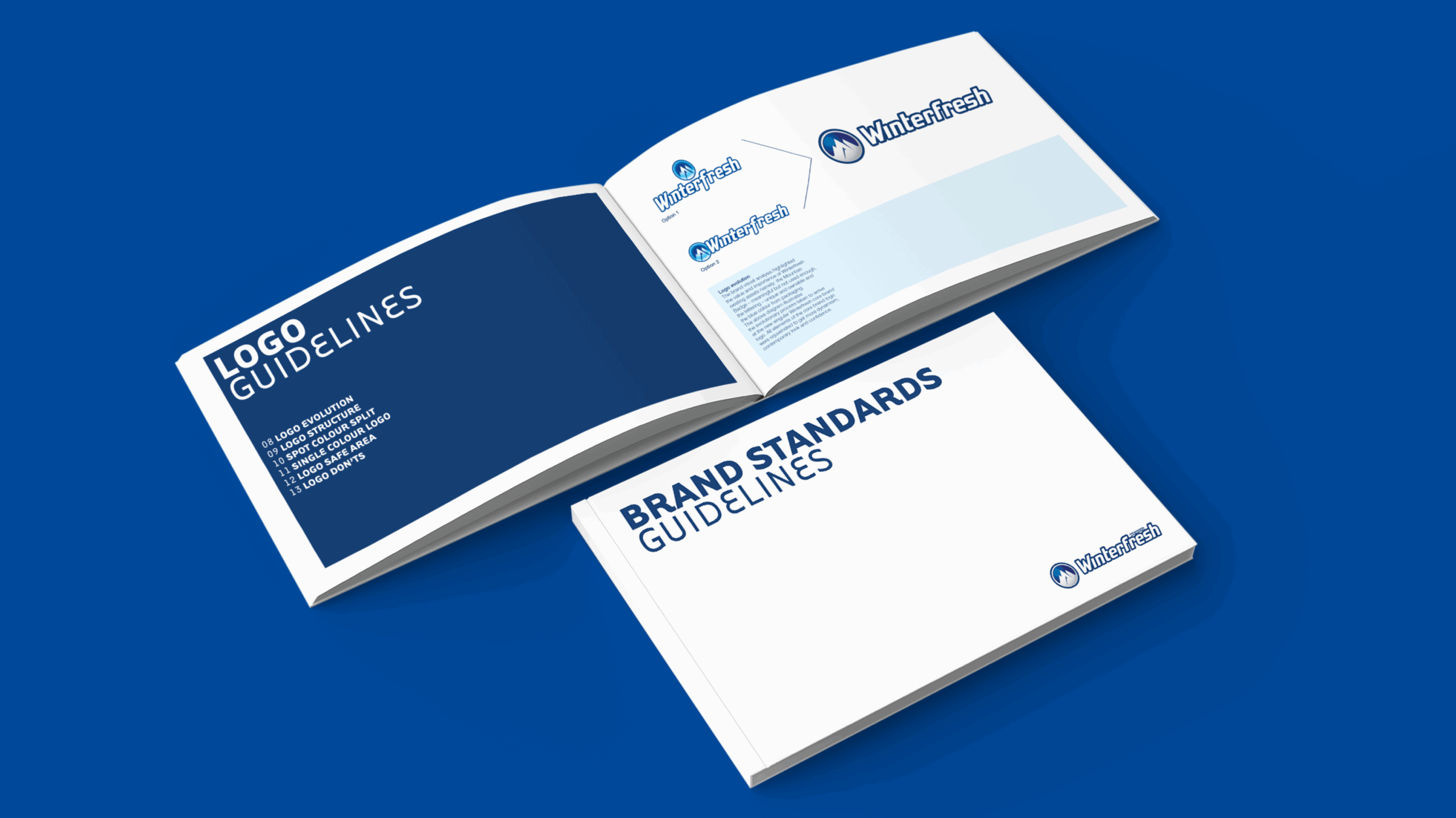
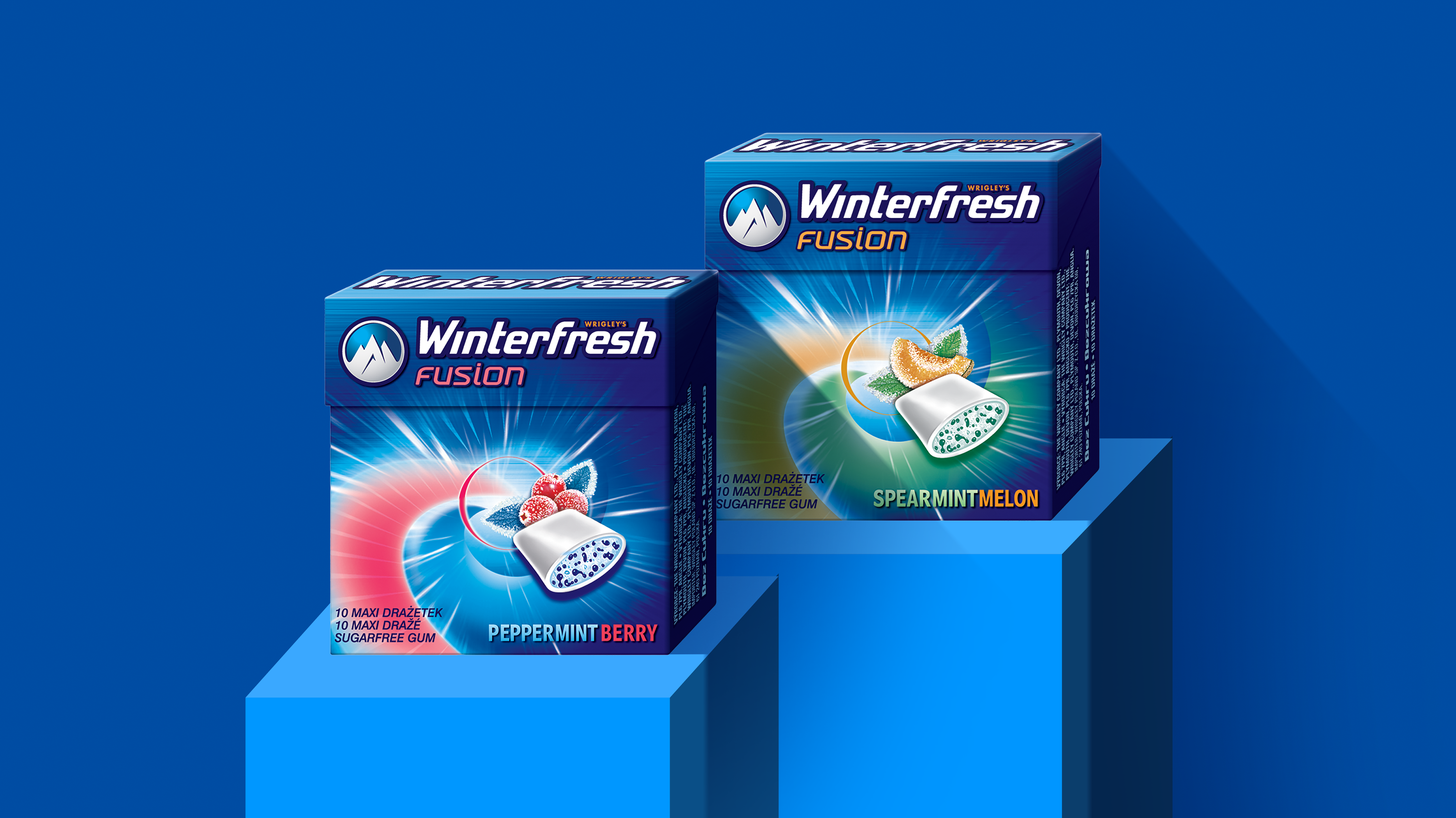
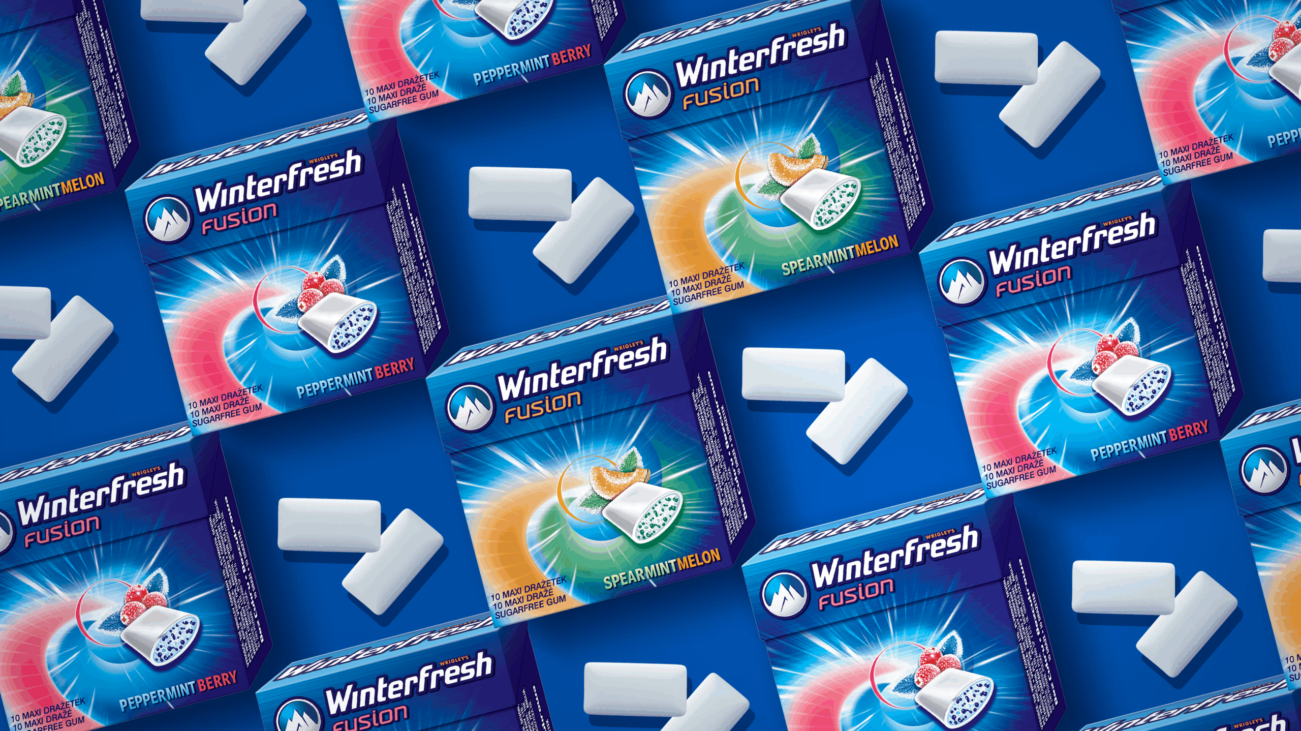
Winterfresh is an iconic sugar-free confectionery brand rooted in the oral care and breath freshening space. To maintain its relevance with the core target group, Wrigley CEE challenged us to bring new energy to the brand. We began with a comprehensive brand visual audit to identify strengths and gaps in perception. From there, we developed a refreshed brand identity that balanced Winterfresh’s heritage with a modern, dynamic look. Our work spanned across portfolio visual management, product naming, packaging design, and NPD initiatives. The new design system unified the brand architecture while allowing flexibility for future extensions. Bold packaging graphics were created to stand out in the competitive confectionery aisle. Clear and inspiring brand guidelines ensured consistent implementation across all touchpoints. The result is a revitalized Winterfresh – the brand that feels both familiar and excitingly new.