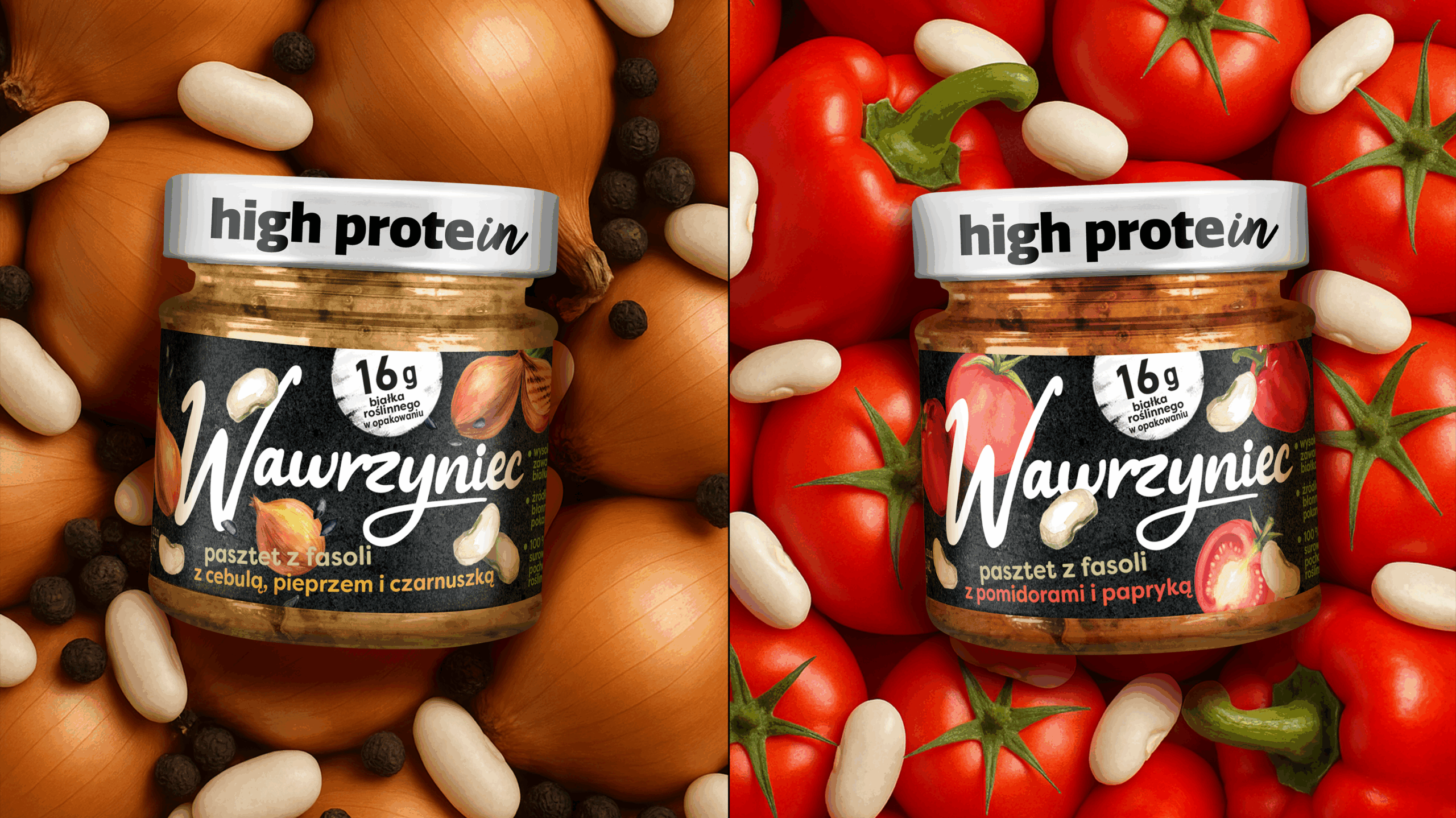
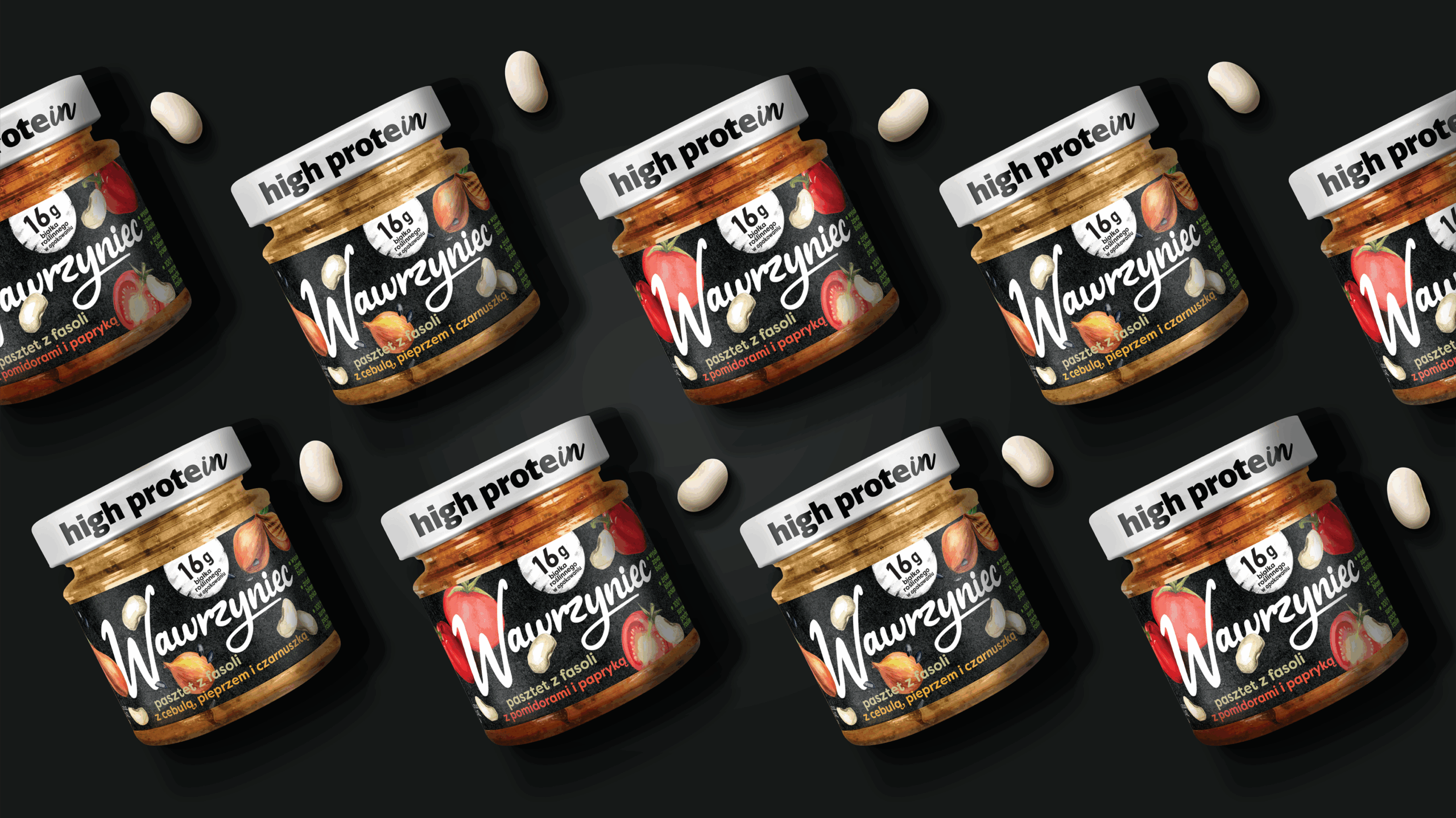
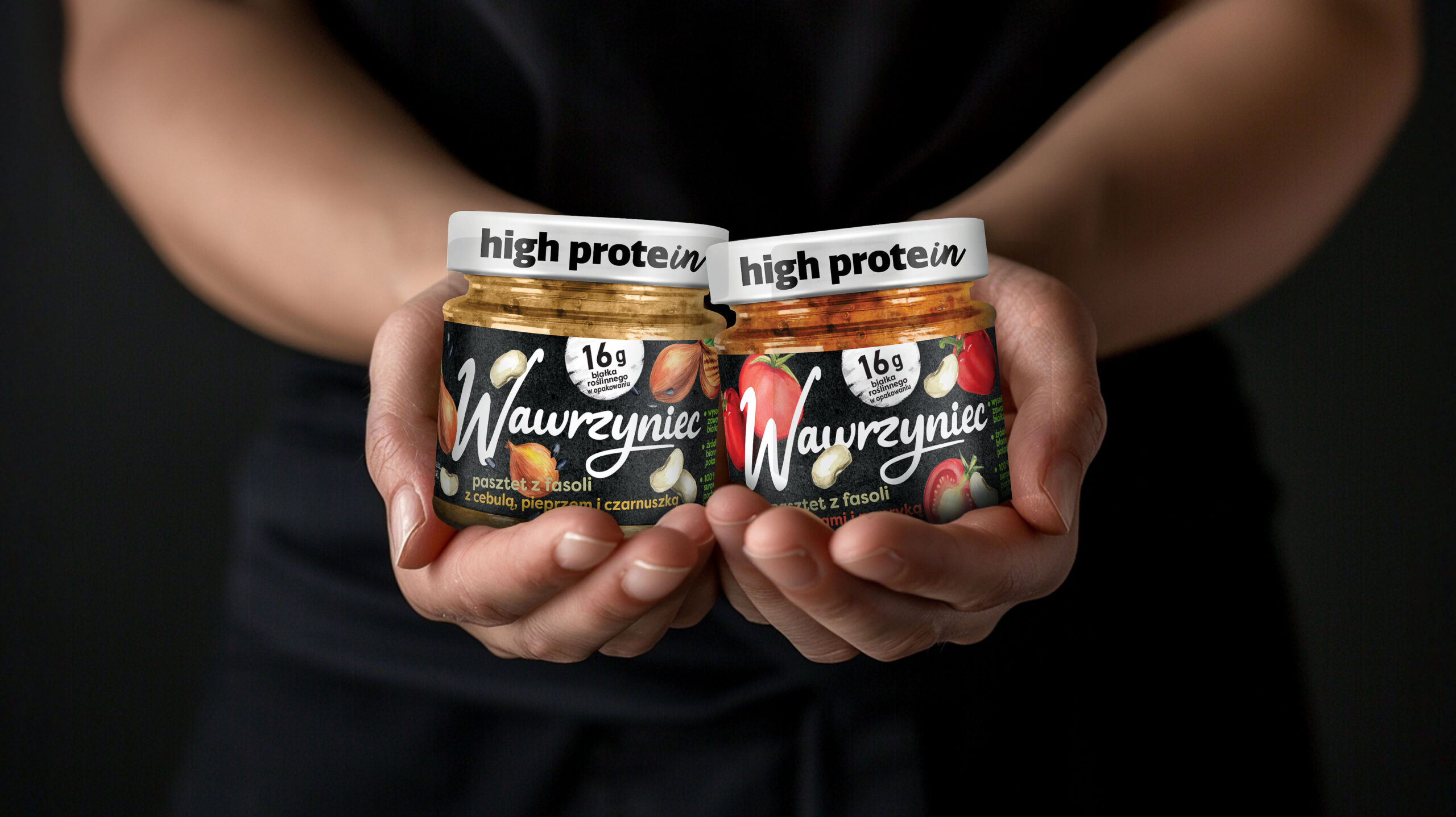
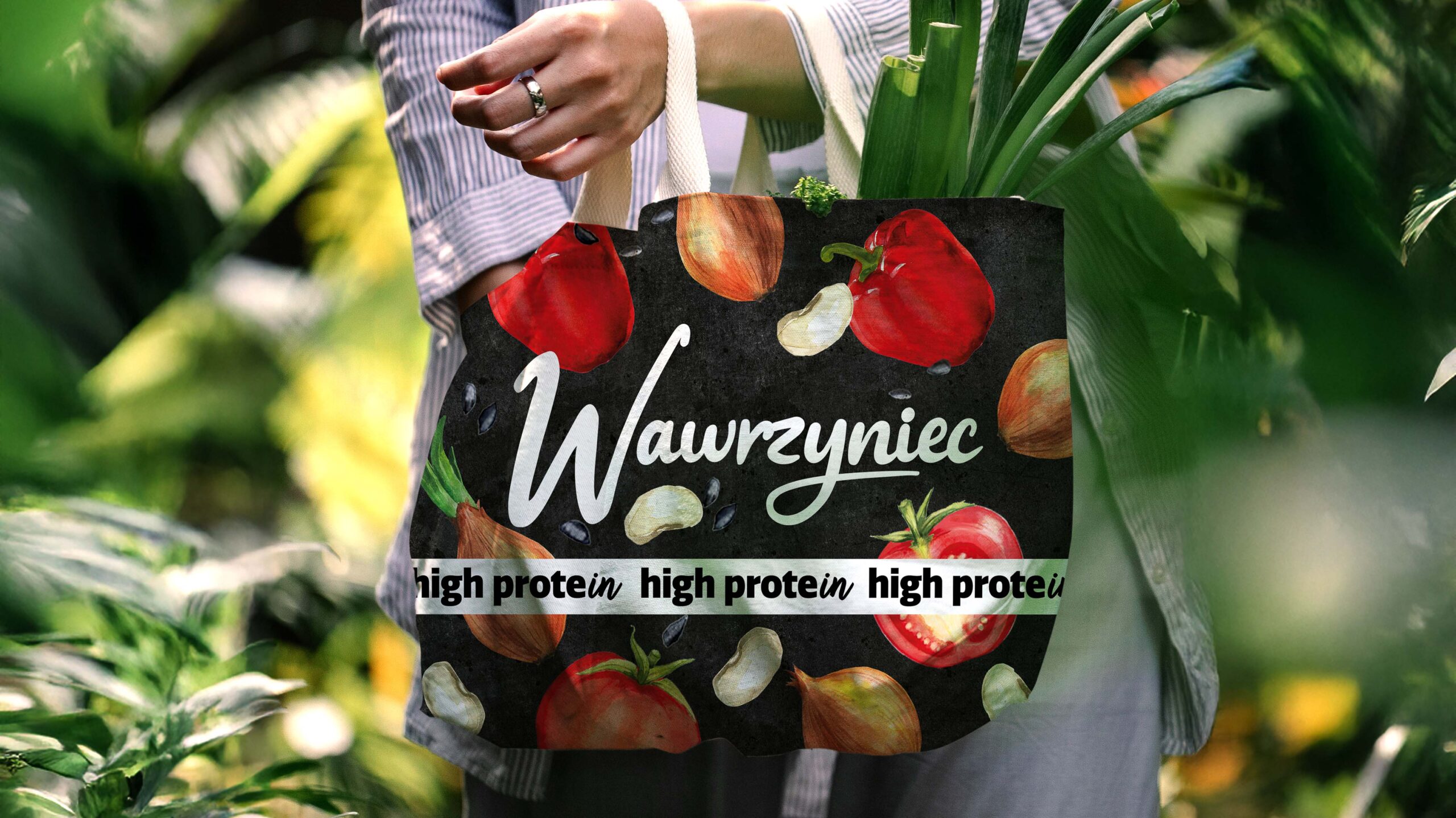
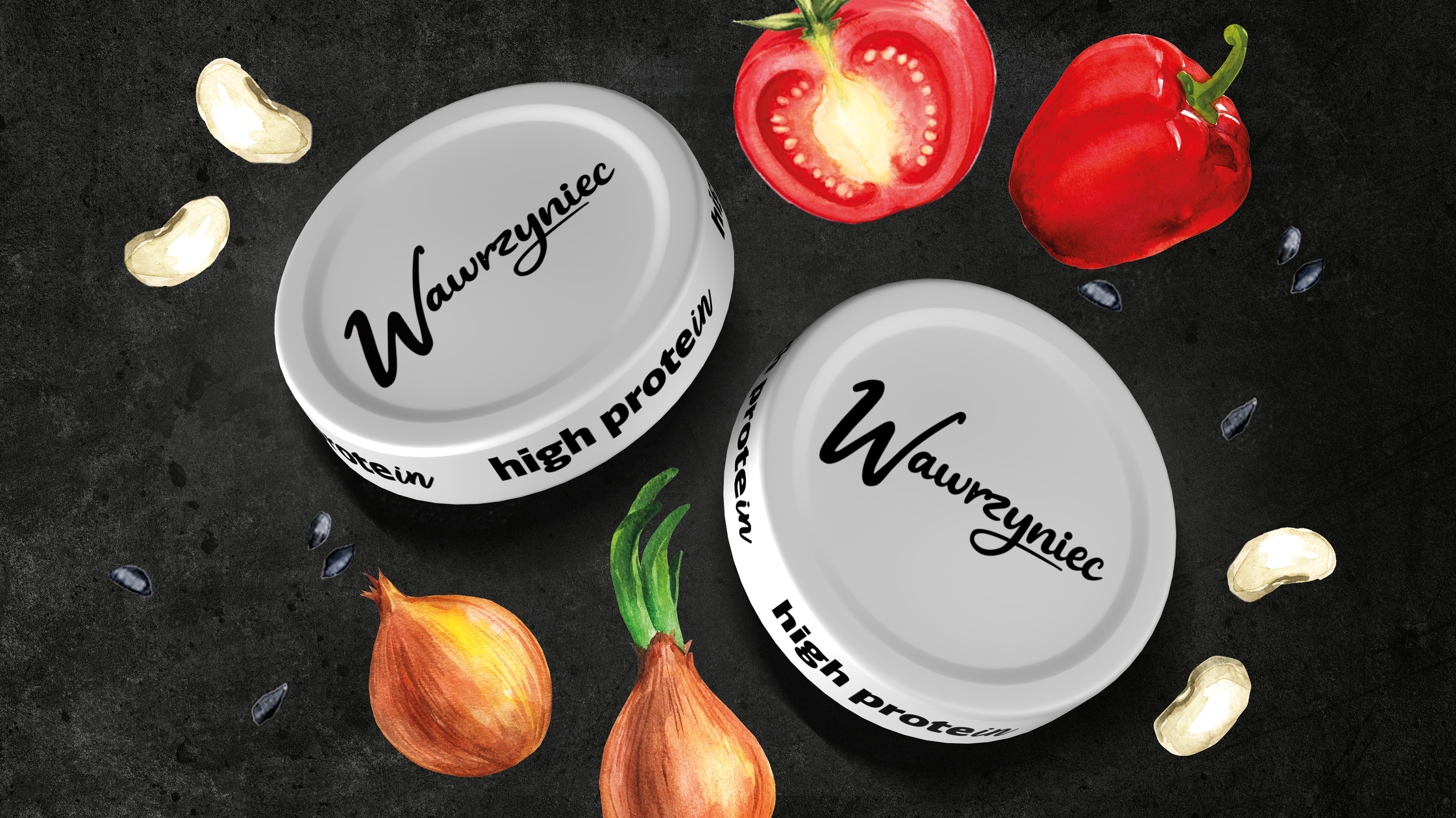
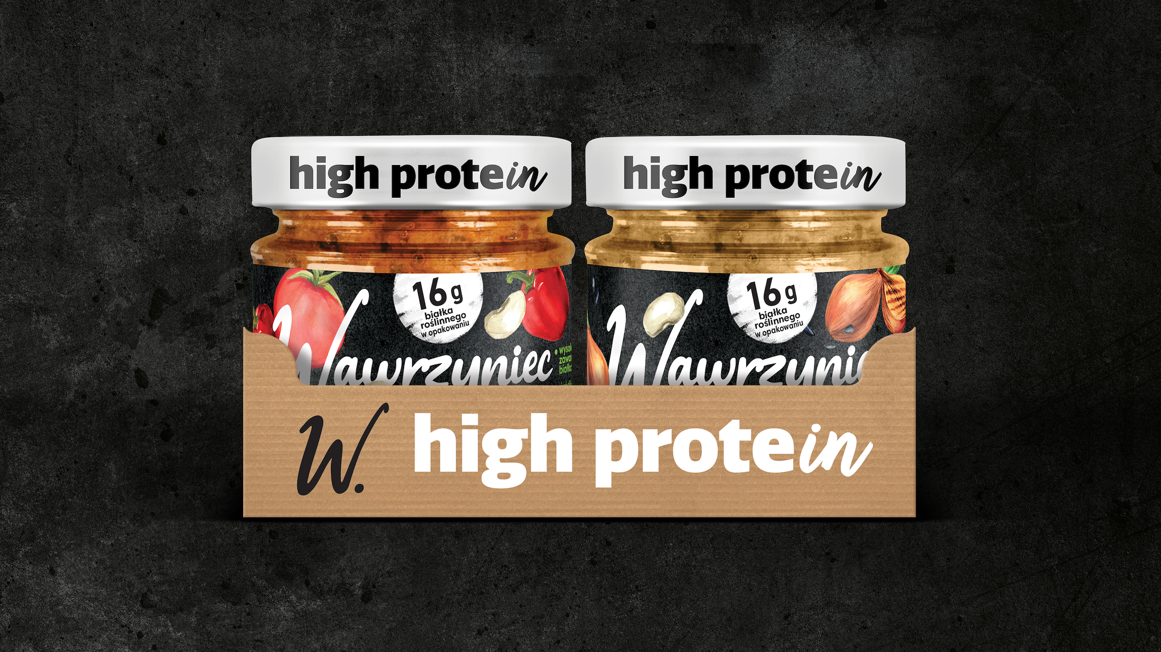
In a market where “high protein” is often associated with powders, shakers, and performance clichés, Wawrzyniec takes a different path. This new line proves that protein can be natural, plant-based, and part of everyday delicious meals. No sacrifices, no artificial promises – just taste and balance. SiebertHead created the packaging design that stays true to the Wawrzyniec brand while introducing a bold and modern visual code for plant protein. The design clearly communicates the benefits and freshness of the products, making them stand out on shelf. With its distinctive black-and-white look, the range signals strength and simplicity while staying appetizing and accessible. This launch is another example of how strategic design can unlock growth, strengthen brand relevance, and connect with new audiences.