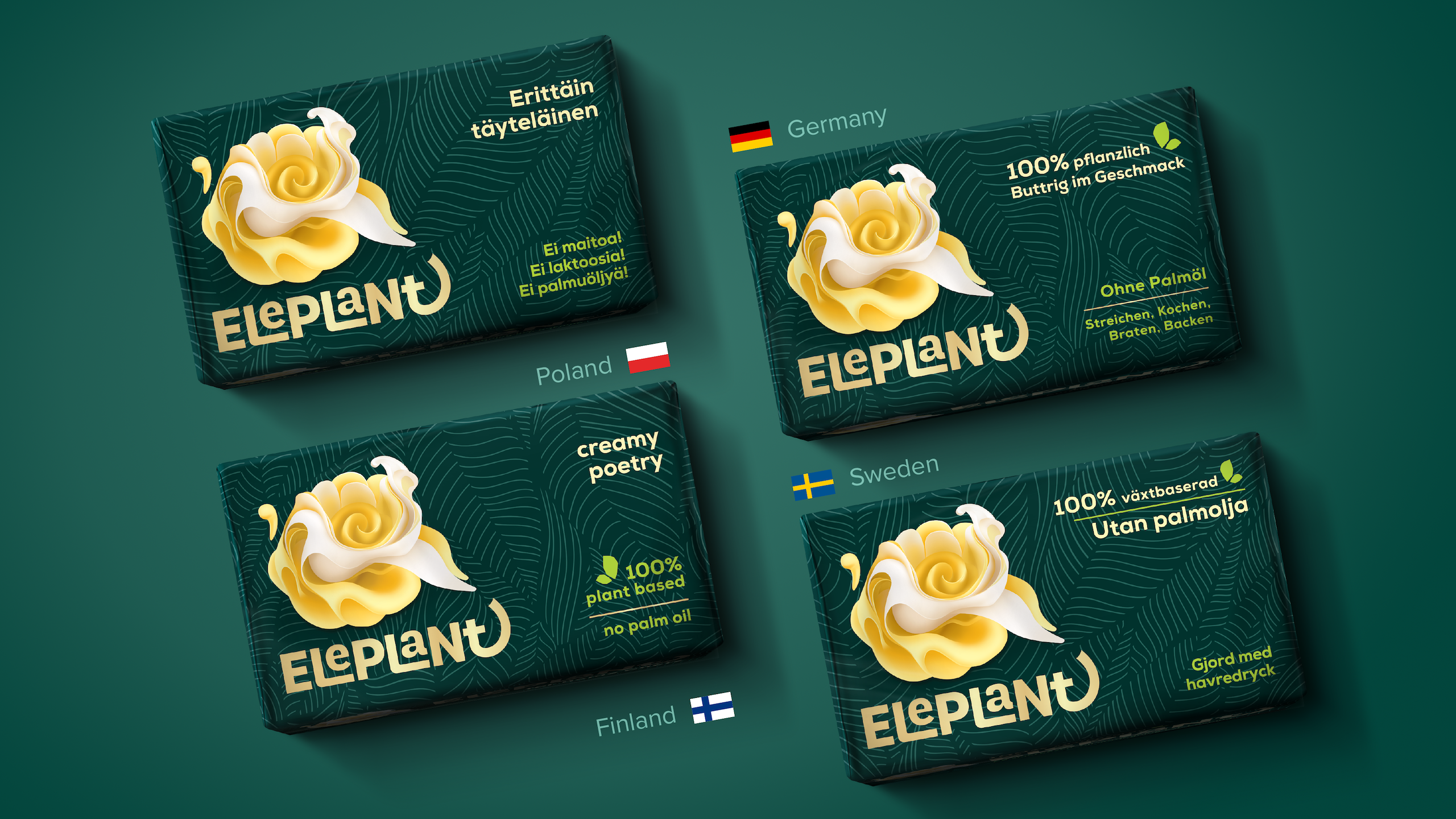
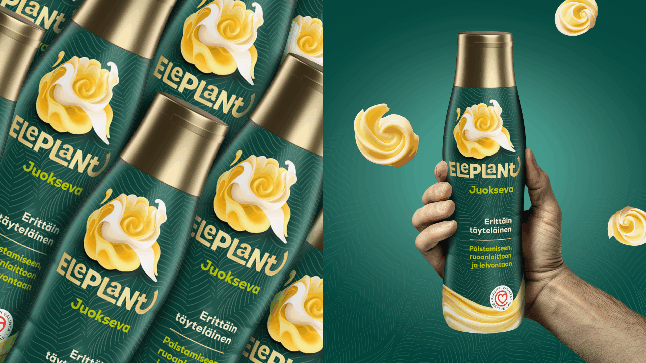
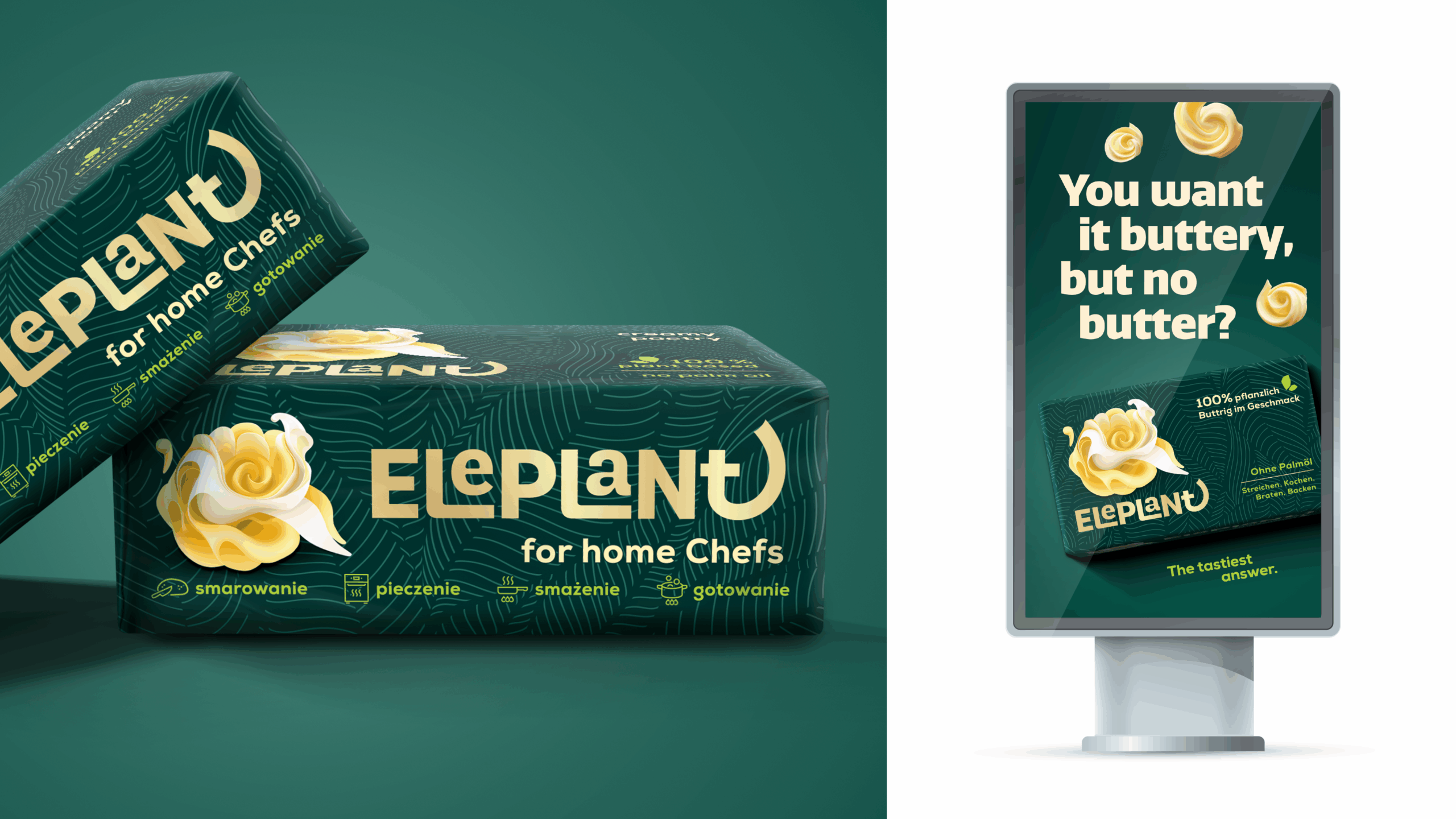
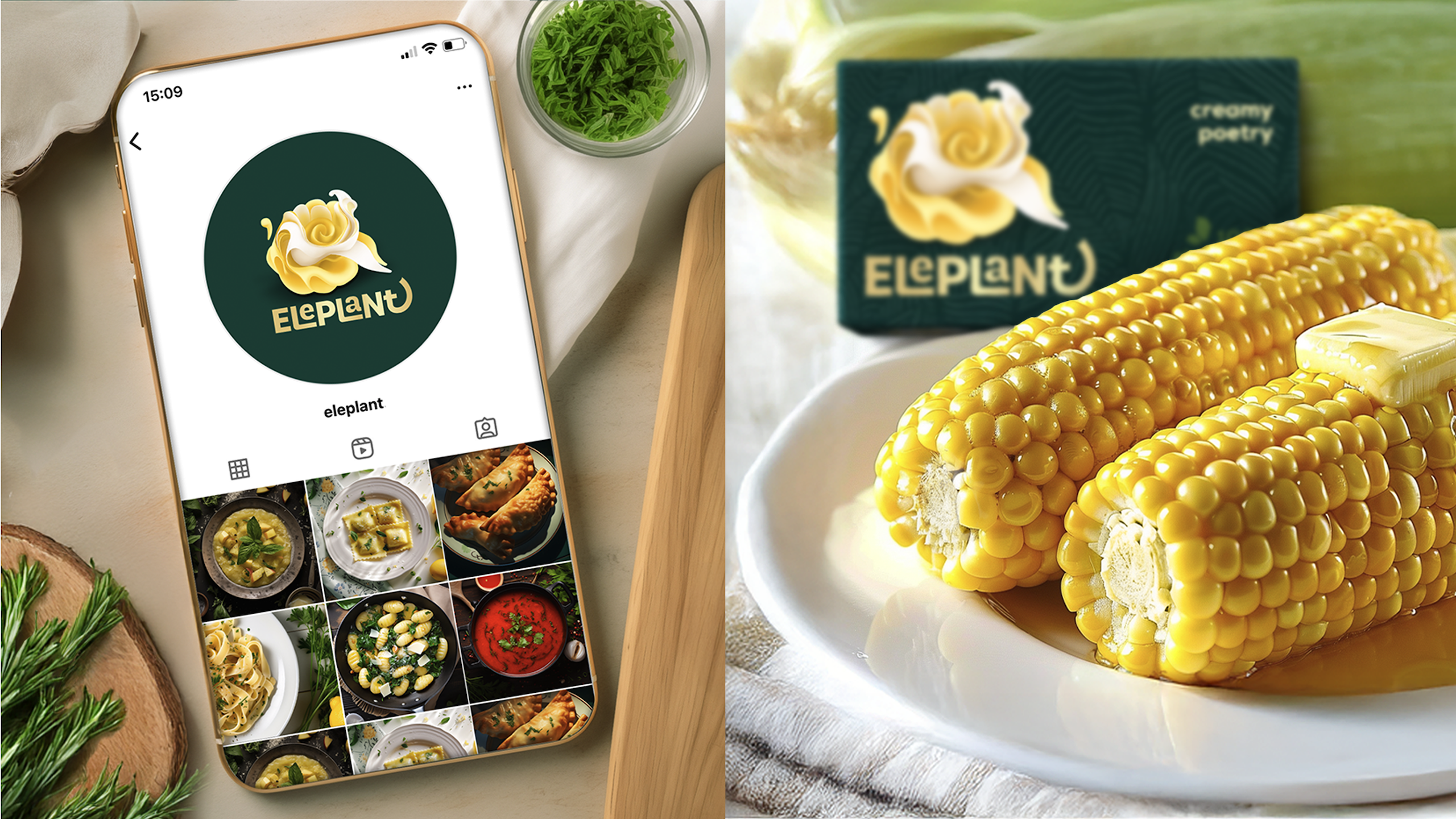
Eleplant redefines the plant-based category, combining creamy indulgence, sustainability, and sophisticated design. SiebertHead created Eleplant from scratch: brand name, brand identity and packaging graphics for Poland, Germany, Finland, Sweden, and Hungary. Built on core benefits, clean ingredients, and the promise of buttery taste, we developed a positioning that removes the trade-off between plant-based composition and culinary satisfaction.
Our design reflects the brand’s philosophy: enhancing flavour while supporting sustainable choices. The blooming, buttery rose logo symbolizes rich & creamy experiences and builds brand recognition. Deep premium green conveys naturalness, while gold accents referring to the classic butter codes and reinforcing taste associations. A strong branding hierarchy ensures shelf visibility through the iconic buttery rose.
We broke away from typical plant-based clichés – no pastels, watercolours, childish illustrations, or cluttered typography. Instead, Eleplant embraces a modern, refined look appealing both to conscious consumers and those seeking authentic buttery flavour.
Consumers choose Eleplant because it delivers a plant-based option without sacrificing taste. The packaging signals quality and inclusivity, making Eleplant a natural everyday choice for all.