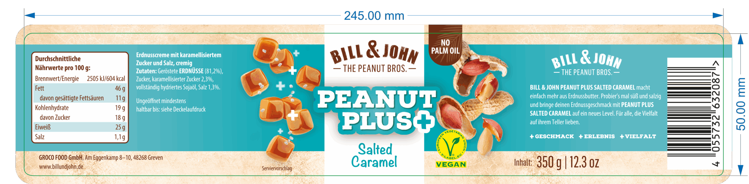
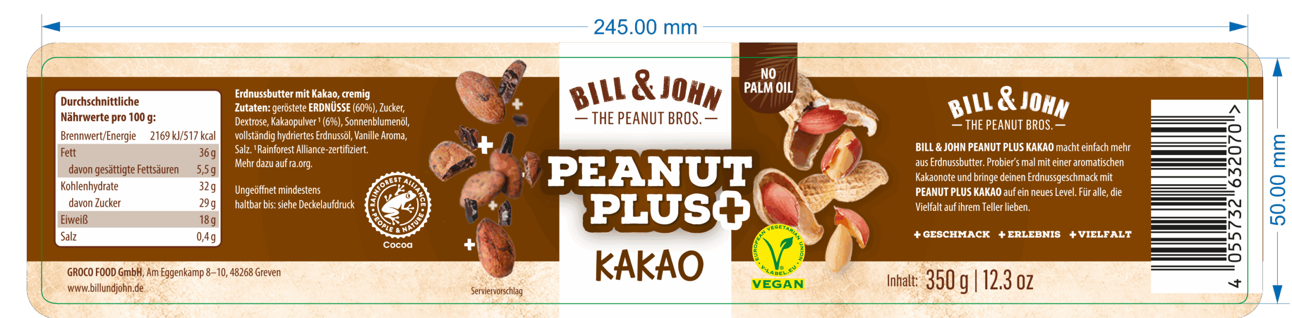
For the “Peanut Cream” range by Bill & John, we developed all series artworks based on the master design, ensuring a consistent look at the point of sale by strictly following the brand’s visual guidelines. From the very start, all technical printing parameters and the requirements for later production were carefully considered, so the labels were not just visually aligned but ready for every print specification. The display, also created in matching colours, was designed to seamlessly show the jars together, making the range instantly recognisable and cohesive on the shelf.