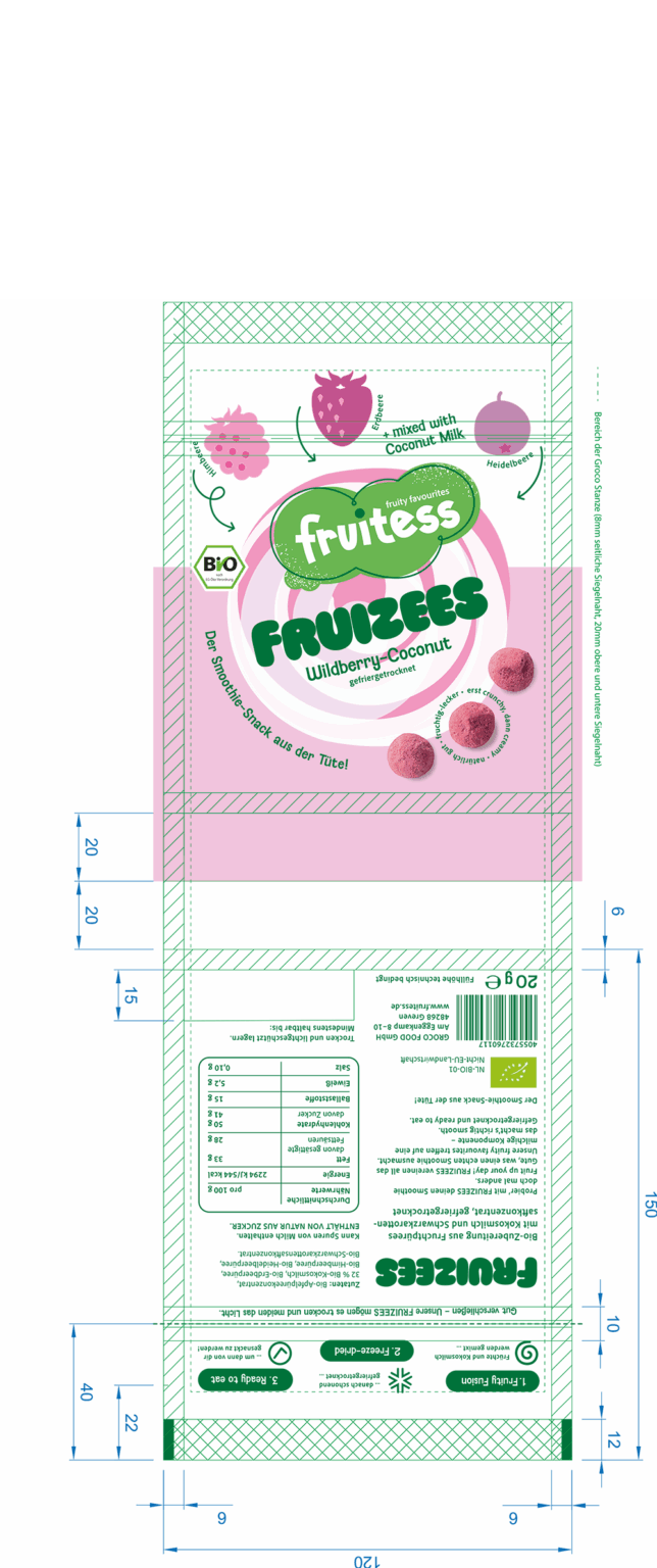
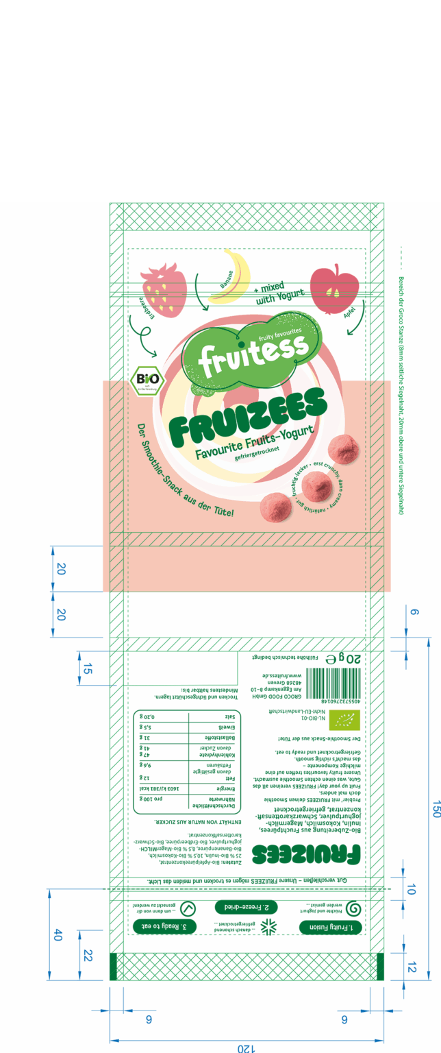
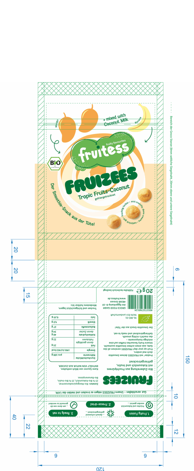
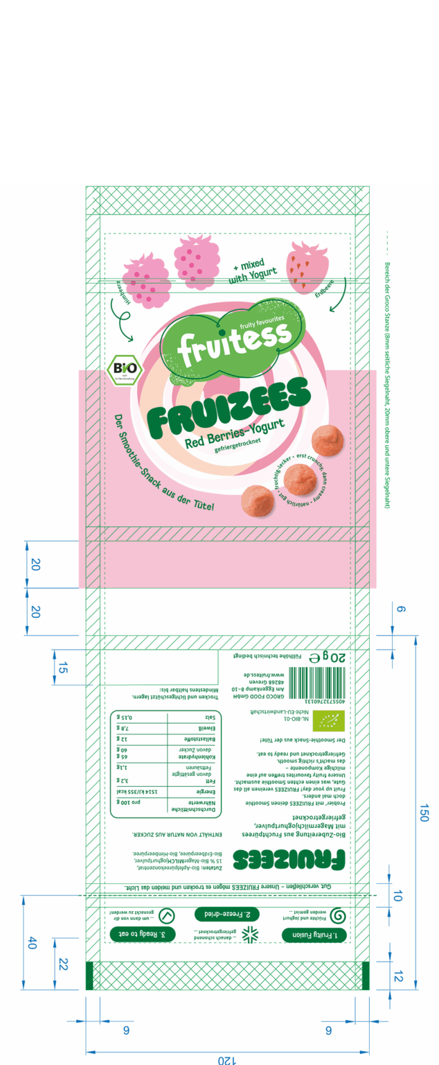
The project for Groco Food demonstrates the successful transfer of a client layout into a print-ready master artwork for the “Fruizees” packaging series. Based on the design master, an artwork was created that took into account the technical printing requirements as well as the unique preferences of the printing house. The goal was a precise implementation for the subsequent production process and the efficient adaptation to additional product variants, as well as to the outer packaging.
The master design was adapted for both 7-colour digital printing and, in parallel, for subsequent 8-colour Flexo printing.
Building on the master, adaptations for the three further varieties were developed to ensure a consistent appearance and to enable easy series expansion.
Through our precise colour matching using our in-house proofing system, we were able to ensure accurate colour reproduction for all four varieties
Another key aspect was the technical implementation of the outer packaging: Here, the designs were precisely prepared for Flexo printing on corrugated cardboard and two different cutting dies.
Close coordination with the printing house ensured consistent brand graphics in both processes.
A highlight of the project was the photorealistic 3D visualisation of all packaging variants, enabling fast and convincing client presentations.
Thanks to the close collaboration between design, technical implementation and the printing house, the project was executed smoothly and efficiently—from the initial idea to a press-ready artwork and the technically accurate reproduction. This allowed for savings in time and costs while maintaining consistently high design quality. The project clearly demonstrates the value of professional design implementation for strong shelf impact and secure, flexible production.